The complexity of creating a visual language that needs to be invisible
There’s a field for UX/UI designers that often goes overlooked and underappreciated, from the external view. That has the importance of creating a seamless symbolic/visual system that a user can understand quickly and effectively conveying a sense of cohesion. The field is called informational design. While the discipline of graphic design has many nuanced aspects within it, Information design itself expands beyond the borders of the discipline altogether.
Taken from Rob Waller, a specialist in information design and director of the Simplification Centre in The UK:
"This field draws on a wide range of specializations for its knowledge base, tools, and techniques. It is both visual and verbal, and it is concerned with user needs more than artistic expression. Often invisible until something goes wrong."
As part of our re-brand initiative at Trustle, the first step involved constructing a new pictographic language, one that adhered to the evolving vision of the company and was reflective of a user’s needs. When we think about the creation of iconography, we usually look to the standard seven principles of icon design:
- Clarity
- Readability
- Alignment
- Brevity
- Consistency
- Personality
- Ease of use
Let’s consider some examples in Trustle’s redesign to show some of the applications of these principles.
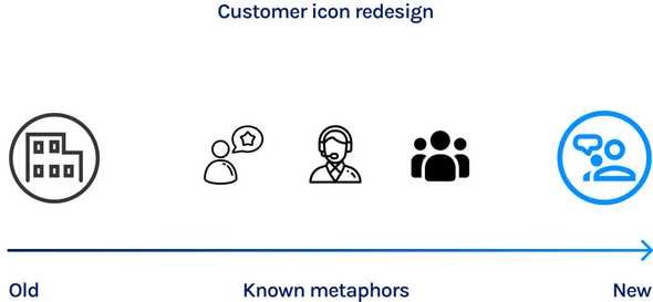
We see clarity when the symbol we chose is recognizable with something that we already know and communicate the concept quickly. For example, the redesign of the icon for the role of “customer.” We found that the initial concept of the office building was too generic, and shifted to one that was more personal and fit more with how users perceived the image of a “customer.”
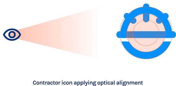
As for the role of the contractor, to make everything balanced, we used the principle of alignment, and here is when we see the typical example of Google’s logo, which is not a perfect circle, but an optical alignment of the elements–sometimes to create a more visually pleasing and understandable icon.
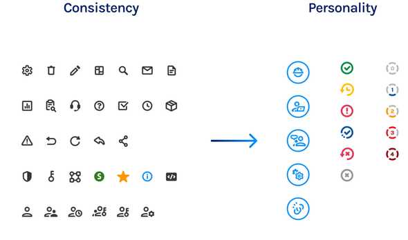
However, for this alignment to occur and not be distracting, we must have consistency throughout, thus creating a unified iconography system and a whole language that the user becomes accustomed to.
This requires that we create a certain style and groups of characteristics throughout every element of the icon’s construction. Since this language needs to be cohesive and reflective of the overall brand of Trustle, the particular stroke weight and rounded characteristics are intentionally constructed to embody Trustle’s ethos–namely, that of a modern, evolved security company.
There’s a distinctive personality within the system itself. That allows subgroups of icons to remain consistent, yet visually different. if the stroke and roundness are what defines (in very very simple terms) the system, then the use of color and size are characteristics that can differentiate subgroups, like roles, sensitivity score, status, and so on.
What is the goal?
There were several layers of complexity within the concepts that we looked at when creating our iconography. As we continued to discuss these nuances, our team concluded that we needed a way to simplify these concepts visually. Otherwise, we would run the risk of causing more confusion to our customers rather than helping. Defining the audience, determining their goals, and understanding their experience and abilities was fundamental in our redesign process. When you can understand the actions that the customer needs and wants to accomplish inside the application, that directly converts these desires into graphic elements.
If iconography is designed well, it will lead a user to where they need to go. If it is too complex and doesn’t align with a visual common language, sometimes the consequences can be severe. A famous example of this was the elections held in Scotland in 2007 where the voters mistakenly voted for the opposite candidate because the ballot paper was confusing and misleading.
This matters to us at Trustle, because if our design language is misleading, it could snowball into larger issues like giving more access than needed or erasing permissions by mistake.
That’s why informational design is a critical field within the UX/UI discipline. So what we design is effective, and accurate. And when done right, is practically invisible.


